Sue Daniel | August 20, 2021 | bitmaps, fills, Sue Daniel, textures, tutorials
 Following the Live Mapping: Repeating Textures session, recently presented by Ralf Schemmann, I will be writing a short series of blogs, or a series of short blogs, illustrating how I go about generating my own seamless tiles. My methods are similar to those described by Ralf in the Live Mapping session, but I thought you might like to know a bit more about the workflow I use.
In this first blog I will be covering how I make seamless textures in CC3 using the available symbols from a chosen style. This is one of the quickest ways to make a new seamless tile since it involves no drawing or any kind of work in any app other than CC3.
To make things even easier I have made a new template, which you can download from the link below and place in your C:\ProgramData\Profantasy\CC3Plus\Templates\Other folder:
Symbol Tile Generator.FCT
This is a very simple template, consisting of a black square on the BACKGROUND sheet, and the frozen MAP BORDER layer. This black square is where you will be making your new seamless tile and will automatically define the extent of the export when it is time to export your new tile.

There is a series of red lines on a sheet and layer that are both called CROP MARKS. These are also frozen so that you don’t end up picking them at any point and moving them around. They are helpful guides intended to show you the extent of the tile you are making once the black square is all but covered in symbols.
The template is loosely based on the Mike Schley Overland style, and is designed to generate tiles that are 1000 px x 1000 px, but it can be used to generate symbol tiles in any style if you locate the relevant symbol catalogue by browsing the directory and adjust the export size.
For this example I will use the MS overland trees to create a seamless tile that I can use in conjunction with the published tree fills that come with the style. This will help to break up any unwanted tile patterns caused by mapping extensive areas of unbroken forest using only the published tree fills.
The first step is to pick the set of symbols you want to use, and start pasting them all over the black square at the default symbol size (usually 1) until there is no more black to be seen between the symbols. Don’t worry about pasting them so that they are in the correct order. Just cover the black square.

Use Symbols-Sort Symbols In Map , right click in the view window and pick All, then press D for do it.


Now to move this block of trees and copy it so that we move the edges to the centre, just as Ralf did with his sand texture in the Live Mapping session referenced at the top of this blog.

Turn the SNAP and GRID buttons on and make sure you have the 50 mile, 2 snap grid selected when you right click the GRID button.
Pick the Move tool and select all the trees with a box selection and press D for do it. Then pick the trees at the central snap point and move that point to one of the four corners. It doesn’t matter which one, as long as you snap the central point to one of the corners, like this.


Using the Copy tool, copy and paste this block of trees 3 times from this corner to all the other corners.
Once you have done this sort the symbols again as above, and hopefully you will have something that looks a bit like this

Now for the magical part.
File-Save as… Pick the PNG Bitmap file option in the Save as type: box, and open the Options dialog. The template you are using has been set up to generate 1000 x 1000 pixel sized tiles, so set the height and width of the export to 1000 x 1000. Make sure the checkboxes are ticked as shown, and CC3 will automatically export just the area covered by the black square, and no more or less than that.
 I exported my example fill to a subfolder within the Bitmaps\Tiles folder. I called my personal folder User, but you can call yours whatever you like. It’s yours.
Ralf covered how to import your new fills in the Live Mapping session linked to at the top of this article, so I won’t make this article any longer than it needs to be by repeating it again right here.
This is the result of importing my new fill and drawing my first polygon with it. Remember that I said the template is designed to give you a tile that is 1000 x 1000 map units? Combine this information with the fact that symbols and fills are ideally imported to overland maps at a resolution of 20 pixels per map unit, and you get a scale of 50 map units to set for your new fill. this should perfectly match the scale of the original symbols you used to create the fill in the first place.

When you have had a practice using just one random collection, try mixing collections, or even using a background texture and spacing out your trees. You can also do this with other symbols, so you could try hills or mountains
Comments Off on Generating Seamless Tiles Part 1 – Making seamless tiles in Campaign Cartographer
ralf | April 11, 2018 | GIMP, guest article, Parchment, Sue Daniel, textures, Tutorial
 Welcome to part 3 of Sue Daniels’ tutorial on creating parchments textures and scrolls in GIMP, where she explains various options of how to produce scroll images from the textures created in part 1 and 2. If you haven’t done it yet, you should first follow part 1 and part 2. As this part is somehwat longer and more involved, we’re providing most of it as a pdf download instead of directly on the blog. Let’s follow Sue along…
This tutorial describes how to use a flat piece of parchment to create a very simple scroll viewed from directly above, using the GIMP.
Due to the length of this tutorial I shall assume that many of the actions used in Parts 1 and 2 of Making parchments and parchment scrolls have been absorbed into the recent memory of interested readers, and that I do not need to repeat them in similar detail here. Where this is the case I will simply list the path in bold text, rather than showing it as a screenshot.
Again, because this tutorial is relatively complex and quite long, I have provided two source files here for you to use, so that you have the materials used in the making of this tutorial. These are the parchment and table top textures that Profantasy has kindly agreed to host. Both these images are my own originals and Royalty Free. They may be used for any purpose you wish.
The numbering of the steps in this tutorial continues from the end of Part 2, so we start at number 37. Words in bold in the instructions are menu items, layer names, or settings in dialog boxes – depending on context.

Continue with the pdf…
About the author: Sue Daniel is active as a cartographer and artist both on the Profantasy community forum and the Cartographer’s Guild. There, she has won 1 Lite Challenge and 3 Main Challenges, and just recently one of the annual Atlas Awards for most creative map in 2017. She has produced many beautiful art assets for CC3+ (such as the “Sue’s Parchments” Annual issue) and mapping in general that are free to use for anyone.
3 Comments
ralf | March 21, 2018 | GIMP, guest article, Parchment, Sue Daniel, textures, Tutorial
Welcome to part 2 of Sue Daniels’ tutorial on creating parchments textures and scrolls in GIMP, where she explains various options of how to vary the resulting parchments. If you haven’t done it yet,
you should first follow part 1.
Part 2 – Optional extras
Varying the basic technique
CTRL + Z is your friend. This is the ‘undo’ button, and I use it all the time. This handy keyboard shortcut makes experimentation so much more rewarding.
Varying the basic technique is a good way of producing a wide range of parchment or paper textures. Varying the initial colour at step 4 is the most obvious. You might also experiment with the opacity of the plasma layer, or alter the modes of both the plasma and noise layers just to see what happens – there is a whole range of possibilities.
Making a parchment that is other than square
There is a very good reason why the basic parchment tutorial was done as a square. While everything else works fine, the Plasma filter used at step 7 distorts if your file has a long side. In the extreme case this is what happens:

This file was created four times as long as it is tall (1000 pixels x 250 pixels). The plasma layer looks like it’s been stretched sideways, and is no good at all unless you really want the result to look stretched for a particular effect you have in mind.
Fortunately, it is relatively easy to remedy this problem.
Continue reading »
3 Comments
ralf | February 22, 2018 | GIMP, guest article, Parchment, Sue Daniel, textures, Tutorial
I am delighted to accept an invitation from Profantasy to present the methods I use to make parchment and parchment scrolls for use as backgrounds in CC3. I hope that you will find the information useful.
Both these methods require you to have and make basic use of the GNU Image Manipulation Program (GIMP). GIMP is a free application and can be downloaded from this page: https://www.gimp.org/
Once you have installed and opened the software, it will be easier for you to follow this tutorial if you set it up so that it looks similar to the screen shots I’ve included. To do that click the Windows menu, and then Single Window Mode.
Your screen should now look like this:

(You won’t have the Script-fu menu item, since this is an add-on I’ve downloaded separately to the main program.)
PART 1 – Making the parchment
Continue reading »
9 Comments
ralf | October 1, 2012 | Annual, starships, storyweaver, textures
We’ve just released the October issue of the Cartographer’s Annual 2012. It contains a huge amount of gorgeous bitmap artwork which focuses on alien starships and landscapes. It was created by Storyweaver (Joseph Sweeney’s rpg company) in conjunction with their High Space setting.

This is the second part of the immense collection of bitmap art, the first part having been released in July. The October issue also integrates all the bitmap artwork and drawing tools into new template wizards based on Cosmographer 3’s Deckplan Bitmap A style.
1 Comment
Clercon | March 15, 2012 | Annual, Jon Roberts, mapping cities, Par lindstrom, textures
Originally posted on mappingworlds.wordpress.com
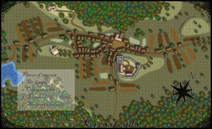
This month’s annual from Profantasy is a new city style designed by the fantasy cartographer Jon Roberts. This is the third time that one of Jon Roberts’ themes are presented as an annual. The two earlier versions have been an overland style and a dungeon style.
I must admit that I’ve really looked forward to the release of this annual. First of all I love city maps and CD3, secondly Jon Roberts is a very skilled cartographer and illustrator so I expected some really nice graphics in this one.
As expected, all the graphics are top notch and I especially like the walls and towers. To test the style I decided to make a rather quick village, called Crossroads, situated in the middle of a forest. The style was easy to work with and if you have done maps in CD3 before there isn’t really any new things to learn here. One little feature I liked however was the ability to make nice shadows on the hills. You can clearly see this on the hill where the temple of life & death (3) is.
After finishing the map there are some things I felt I need to work a bit more on next time I’m using the style. First of all the fields didn’t turn out great in the map; probably I have to try to put some more time on them in the future. When I started doing maps in the included styles in CD3 it took me a lot of trial and error before I got the fields right. So I have some more testing and practice to do here.
Another thing to think of is that in this map I had quite some open space between the forests and in the background texture you can see a pattern. I think the solution here is to add in some more different textures to hide the pattern. If you look at the included map in the annual you don’t see this pattern there.
At last if you look at the trees in the forest you can see that the northern forest has the trees more closely to each other. I actually think they got too close so in the southern forest I put some space between the trees. This made the forest look much better, in my opinion.
Overall I think the style is really strong. I like the darker colours of this one compared to the included styles in CD3 (which means less editing in Photoshop for me) . Still it takes some time to get to know the feeling of a new style, to get all the things in place in a good way. This one surely needs som more practicing for me before I’m there.
As usua,l I added the labeling in Photoshop, and I also selected another font. If you want to use the font I used it’s called Blackadder regular and can be downloaded from dafont.com for free.
1 Comment
 Following the Live Mapping: Repeating Textures session, recently presented by Ralf Schemmann, I will be writing a short series of blogs, or a series of short blogs, illustrating how I go about generating my own seamless tiles. My methods are similar to those described by Ralf in the Live Mapping session, but I thought you might like to know a bit more about the workflow I use.