Here’s a preview for Sunday’s upcoming Annual issue. Herwin Wielink‘s beautiful overland style:

Originally posted on mappingworlds.wordpress.com
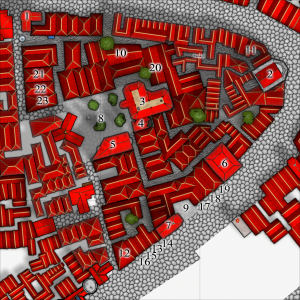
In my last post I presented the City of Lost Souls. The idea of the city has been in my mind for a long time as a city that originally was created by outcasts from the ordinary society. Outcasts that in the end have created a powerful city, a city made untouchable because of its location in the middle of a maze like river delta.
In this post and the next couple of post I’ll try to describe the process I’ve developed when I create cities. I don’t say that this is the best way to do it but it is one way to do it. To exemplify the process I’m using I will use the map of the City of Lost Souls.
When I decide to make a map it is always easier to start if you can get some inspiration from the real world. One of the best tools you can use is Google earth. You can learn tons of information just by moving around the globe looking at old cities, land formations and following rivers through the landscape. In this particular case I looked a lot at river deltas and cities situated at the end of rivers.
You will never find anything that will look exactly like the part you want to create, but the idea here is to find real world location that can inspire you, and that you can copy bits and pieces from. In this way you can create a map that will look much more convincing than if you just draw something from your head.
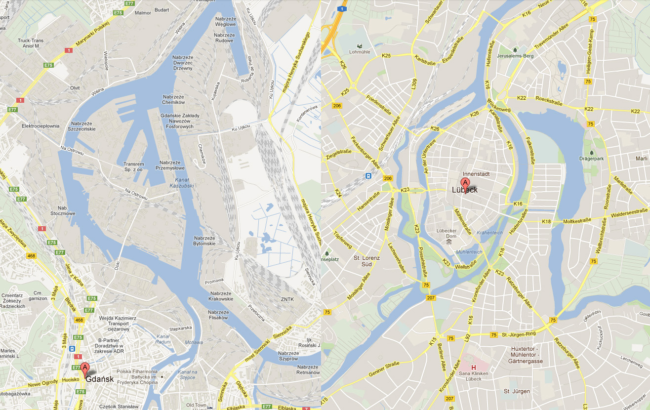
I soon found two cities that gave me the right feeling. These cities were Lübeck in the northern parts of Germany and Gdansk in Poland. None of them was perfect but I liked the flow of the river around the old part of Lübeck (as you can clearly see in the map), but this part missed a harbor. So I picked the harbor from Gdansk for the map. I also added in some more rivers to get the feeling that the city really is situated in a river delta.
In City Designer 3 (CD3) I then started a new map and started to draw the rivers. During the process I looked at the cities for inspiration but still trying to do something original. While creating the island where the actual town would be I draw the outline of the harbor already at this stage. In this way the shadows between river and land would be right later on. So at this stage I had a quite clear picture on how I would progress with the city. In the picture below you can see the result when all the terrain was done. Next step would be to start on the actual city.

Created by Jonasgreenfeather on the ProFantasy Forum.
He says of this ship, created with Cosmographer 3:
Like many forum members, I’ve been drawing maps (both fantasy and sci-fi since I was a kid of 9 or 10 years
old). I’ve had CC3 since February-ish of last year, but took a really long break from it while I was looking for work. I think that my tenacity and OCD makes up for my lack of initial planning and can’t keep things well enough alone 🙂 I often only have a faint image of how a landscape, ship or city is going to end up and each often goes through several revisions before I’m satisfied with the result. I find it’s a very organic (and sometimes frustrating) process: the land shapes the features shapes the cities and roads shapes the land…
The ship in this thread grew from the idea of an engine and a bridge connected by a spine, different modules could be plugged into the spine depending on the mission requirements (living spaces, labs, hanger bays, cargo, etc.) BUT… when I started drawing the modules I drew the rooms to small and nothing fit in the “slots”, so I took what I liked (the bridge) and then built the captian’s cabin, first starting with the furniture and then building the walls. Once that was done it was time to think about the “why” of the ship, it made sense to me that the captain and first officer would have cabins on different sides of the ship (in case of attack one hit wouldn’t take them both out). So I coppied the bulkheads of the captain’s room and turned it into the XO’s and NCO’s quarters (as they would have less room than the CO)! the rest of the ship just sort of grew from there.
Well, that was a bit a tangent but gives you an idea of how I Cartograph (is that a word?)! To summarize, I’m playing, learning and expermenting all the time to share what I see in my head with others.


Originally posted on mappingworlds.wordpress.com
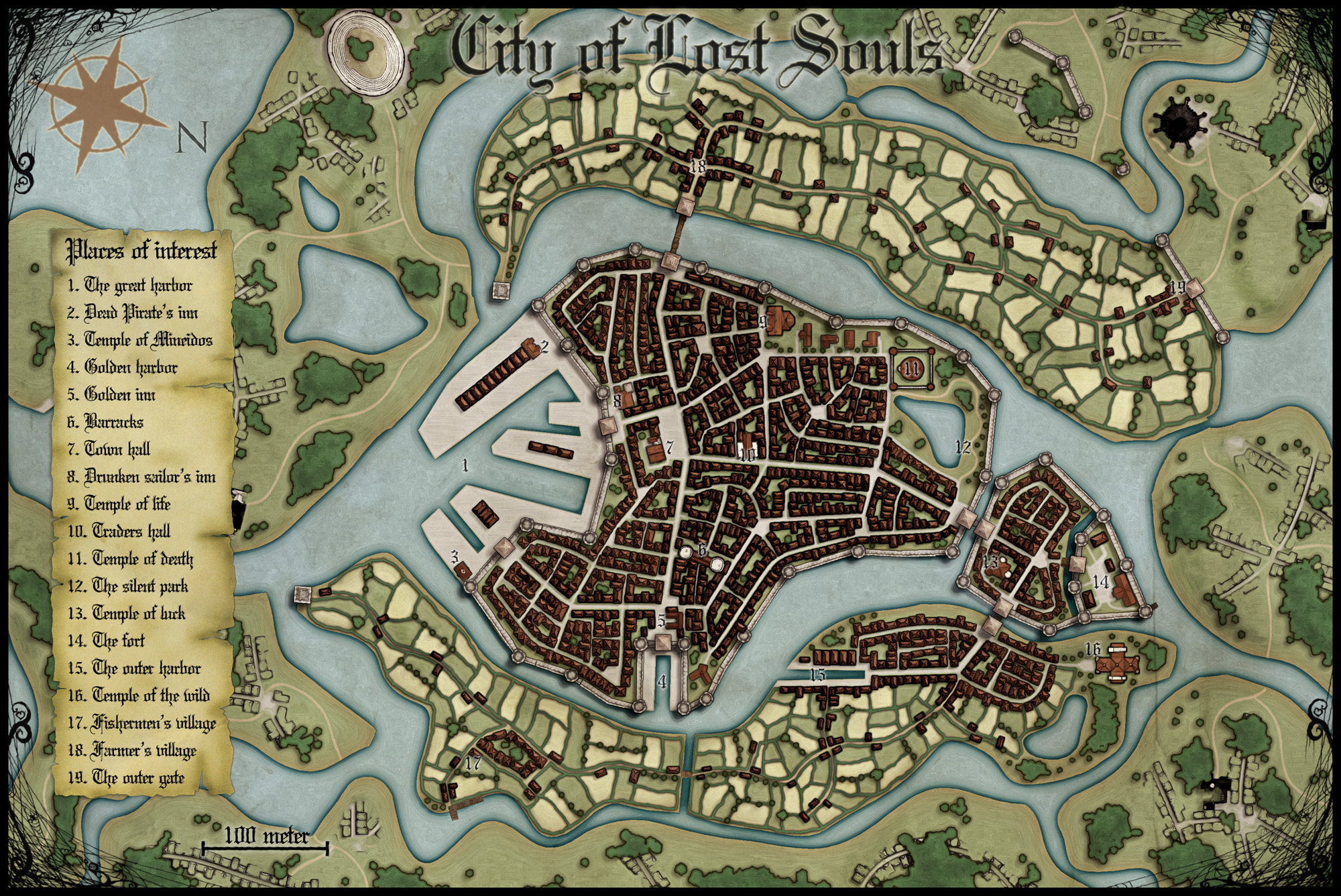
This is a map of the City of Lost Souls. The map is done in City designer 3 (CD3) from Profantasy combining the included styles A and B with the latest annual city style by Jon Roberts. The end result from CD3 has then been quite heavily edited in Photoshop, where the labeling also has been done.
In the next post I will go through the process of creating the city. Until then you can have a guess on which two real world cities that inspired me while making the City.
As always when I make maps I try to add a story to it, this makes it easier to picture what I want and what to put into the map. As for the City of the Lost the story goes something like this:
Originally posted on mappingworlds.wordpress.com
This month’s annual from Profantasy is a new city style designed by the fantasy cartographer Jon Roberts. This is the third time that one of Jon Roberts’ themes are presented as an annual. The two earlier versions have been an overland style and a dungeon style.
I must admit that I’ve really looked forward to the release of this annual. First of all I love city maps and CD3, secondly Jon Roberts is a very skilled cartographer and illustrator so I expected some really nice graphics in this one.
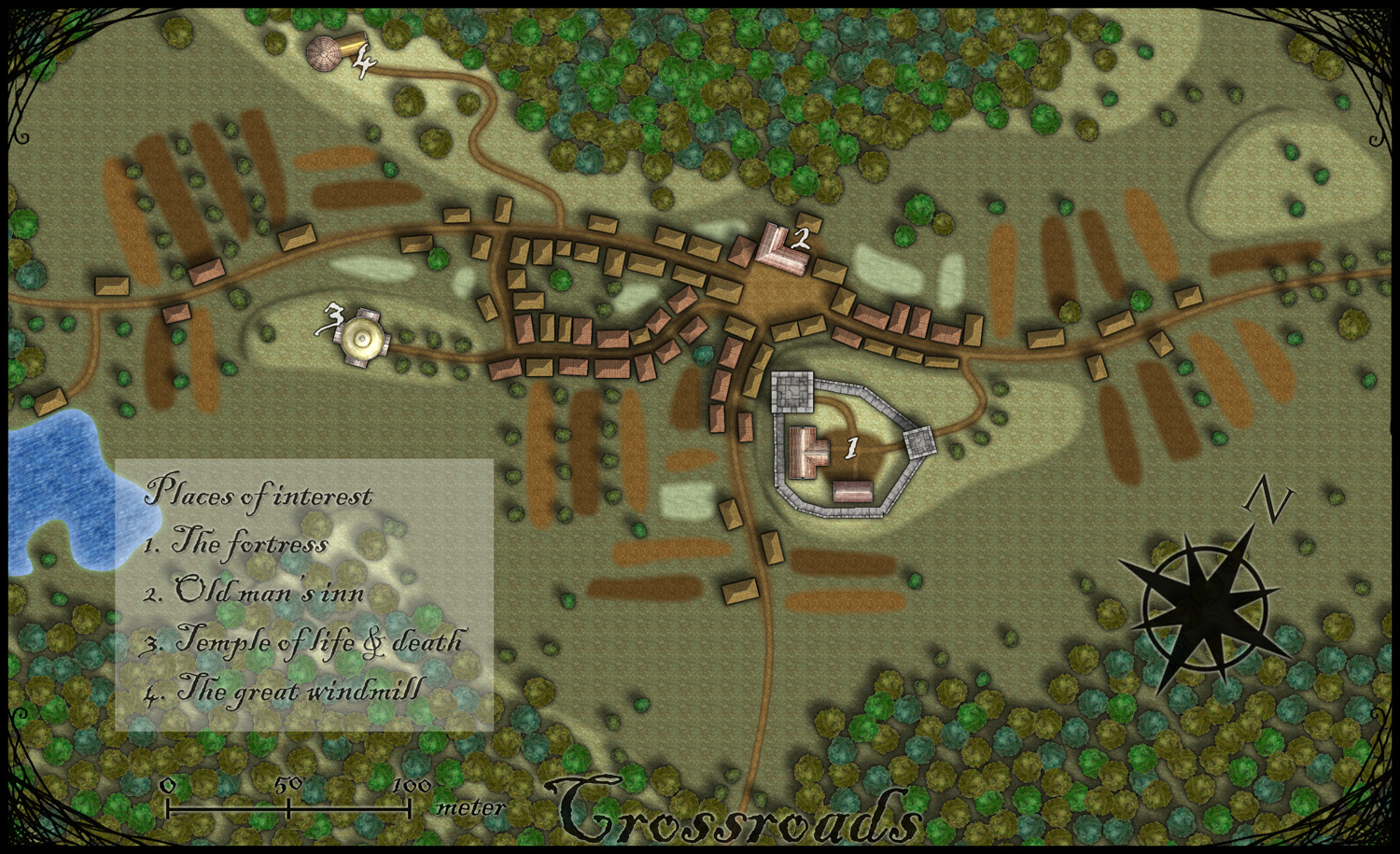
As expected, all the graphics are top notch and I especially like the walls and towers. To test the style I decided to make a rather quick village, called Crossroads, situated in the middle of a forest. The style was easy to work with and if you have done maps in CD3 before there isn’t really any new things to learn here. One little feature I liked however was the ability to make nice shadows on the hills. You can clearly see this on the hill where the temple of life & death (3) is.
After finishing the map there are some things I felt I need to work a bit more on next time I’m using the style. First of all the fields didn’t turn out great in the map; probably I have to try to put some more time on them in the future. When I started doing maps in the included styles in CD3 it took me a lot of trial and error before I got the fields right. So I have some more testing and practice to do here.
Another thing to think of is that in this map I had quite some open space between the forests and in the background texture you can see a pattern. I think the solution here is to add in some more different textures to hide the pattern. If you look at the included map in the annual you don’t see this pattern there.
At last if you look at the trees in the forest you can see that the northern forest has the trees more closely to each other. I actually think they got too close so in the southern forest I put some space between the trees. This made the forest look much better, in my opinion.
Overall I think the style is really strong. I like the darker colours of this one compared to the included styles in CD3 (which means less editing in Photoshop for me) . Still it takes some time to get to know the feeling of a new style, to get all the things in place in a good way. This one surely needs som more practicing for me before I’m there.
As usua,l I added the labeling in Photoshop, and I also selected another font. If you want to use the font I used it’s called Blackadder regular and can be downloaded from dafont.com for free.

Looking good: CC3 installs and runs fine in the Windows 8 Developer preview.
 We’ve updated the Fractal Terrains demo to version 3, so you can try out the new functionality of our random world builder at your leisure.
You can download the 14-day-trial version of FT3 from our demo page.
More information on Fractal Terrain 3 is available on its product page.

First buildings with effects on
Ok, we’re going to spend time today filling in a block section with houses. We’re going to be using the House command from CD3 extensively, so you should be an expert in it once we’re done.
The house command is in the ![]() upper left corner of your toolbar and looks like a roof seen from the top – a screen shot is to the right (you can see the “House” tooltip as well):
upper left corner of your toolbar and looks like a roof seen from the top – a screen shot is to the right (you can see the “House” tooltip as well):
We won’t spend a lot of time going through the different options, but I recommend that you review two sections of the online help (Help>Search):
- House Shapes: Good information about what each shaped house is, and the order CC3 expects corner points to be placed. Generally you will place two points that define the long axis of the roof, but the interpretation of the third point varies from shape to shape.
- Roof Types: Gables and styles of roofs.
Scrolls through the House settings part of the dialog to look at available styles. I recommend that once you have found a style you like, place one or two buildings and scroll out until the map is roughly the size that you will use. Some of the house styles have wonderful detail that looks great in-close, but which compresses to a black blob when you scroll out a long way.
I’m using the CD3 B Fantasy varicolor symbols. The roof lines look great at medium resolution, and I plan to not show the individual buildings when I am using a city-wide map. Varicolor means that the building will pick up the currently selected color – this gives you flexibility to change colors periodically to add some needed variation to the buildings.
Start with rectangular buildings – they are most common in real houses, and easiest to place.

City block almost completely filled in
I like moving along a major road, placing one building after another. Here are some tips:
- For a medieval city, don’t worry too much about getting each building front exactly lined up with the buildings next to it – there will be variations in real life. But do use the “Parallel To (F11)” and “Perpendicular to (F12)” snaps (Tools>Snaps) to ensure that buildings square to the road or to each other.
- The roof line will run parallel to the first side you draw – so for most buildings you will want to put your first point at the street and the second point well back from the street so that the line is perpendicular to the street (the F12 snap is made for this – put your first point, press F12 and select the edge of the street, now your next point is constrained so the wall must be perpendicular to that street).
- If you are using varicolor symbols, set the color slightly darker than your landmark buildings and change the color a little from time to time. It will give your city a subtle but more realistic look.
- Use a small number of building types and roof types – it will make the city look more cohesive.
- Every building will need access to the road. Better establishments should have two ways to get to the road (e.g. a front door for visitors and a back door for trash and other things). Access can be circuitous, through an alley, but a building can’t be used if no one can get to it. But don’t worry too much if you block access to an occasional building. You have several ways to explain it:
- The building is no longer used.
- The building has been annexed (one of the adjoining buildings is connected through to it) or is associated with one of the nearby buildings and is accessed through it.
- There is a passageway – a covered street or entryway leads to the blocked building, the passage is just not visible on the map because it is under the other building’s roof.
-
- Block with buildings filled in, some details and effects on
Work a little way down the street, then put a gap in the buildings. This will be aplace for an alley. Start putting buildings away from the street to continue defining that alley.
- If you followed the approach of roughing out each block, eventually you will find a situation where you have an irregular space. This is the perfect place for a V-shaped, Skewed rectangle (called a four-sided building in the dialog), or a many-sided building. These buildings are infrequent in a real city, so see if you can find a way to fill the space with one or more rectangular buildings. But if not, enjoy placing these unique buildings.
- Do put in occasional squares and open spaces, whether they have trees in them or not. Even if these are in back alleys, they will visually break up the city sections.
- Save often. I like to use “Save As” with a file name that ends with a number – each time I save I add one to the trailing number. That way if something goes wrong (artistically or technically), I have something to return to. Save often enough that you could endure losing work, e.g. if you can endure losing your last 15 minutes of work, you can back up every 15 minutes.

Next time we will fill in a few more details in this section and talk about rendering effects – they turn the most mundane map into something wonderful. Then for a break we will turn to mapping some sections outside the city wall, where the CD3 automatic tools really can shine.
The video shows how the different armour parts of a CA3 figure can be layered over each other to make any custom combination of parts.
Originally posted on mappingworlds.wordpress.com
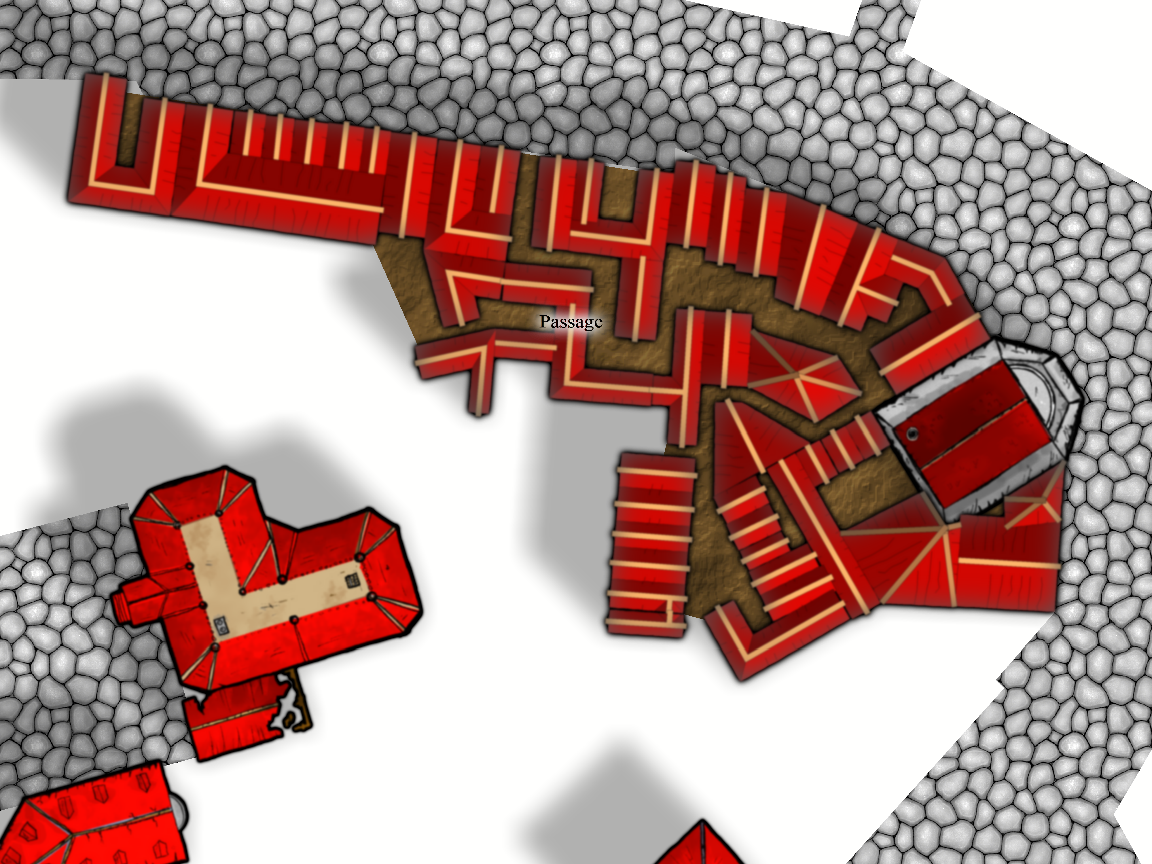
I’ve always been very fond of Dwarves and their mines as a great location for an adventure. I guess you can blame this on Tolkien and his description of Moria. I still remember how excited I was when I saw the Lord of the rings on TV for the first time (now we’re talking about the old film, not the new ones) and they entered the old mines full of orcs.
This map however is only of the entrance to a Dwarven kingdom. It is made in the Dungeon Designer 3 add on for Campaign Cartographer 3. The style used is from the 2011 annual, Jon Roberts Dungeon. This particular style is actually free for anyone to download.
When I map some kind of fortification I always try to picture how an attack on the area would be done. How could I defend the area in the best way? Whoever that want to get past the fort has to pass through the entrance hall (1) on the map. So I wanted the entrance hall to be well guarded, I accomplished this through the watchroom (5) next to it. From there the guards can watch who enters and also shoot at them. The inner iron door will hopefully prohibit any hostile intruders from getting any further in.
The two towers facing the outside (4a-b) are also good spotting areas from where you can see who’s approaching as well who’s standing in front of the gates. I try to continue thinking in this way while mapping, other important aspects are where will the guards sleep, eat or relax? Remember this is a place where the guards probably spend a week at a time before they are relived.
In the end I also added the secrete passage (11). This passage shouldn’t really be there because it is a huge security risk. The reason I put it there was that if some adventurers need to sneak in past the guards they need a way to do it. So the passage was added to make the map more fun to use in an adventure.
This was the first map I made in Dungeon Designer 3. The program however I feel is the most complicated one from Profantasy, mainly because there are so many different things you can add and have to take into account. It took me a long time to realize that I in this map actually by mistake used the wrong beds and tables (they are from another style then the one I intended to use). So it was very good to have the pdf from the annual style to use as a guide while exploring the program. This however doesn’t mean that this is a bad program in any way, probably the contrary. But it crave from you as a user that you take the time to learn it.